
What makes an image look generated has changed. The models now render competent hands, legible lettering and photoreal faces without breaking a sweat, so the old technical failures are mostly gone. What replaced them is subtler and more consistent: a bundle of aesthetic defaults the model reaches for when nobody tells it otherwise — safe, smooth, centered, glowing. These six tells are not limitations. They are habits, and every one of them is correctable with a sentence.

1. Mannequin skin with no pores
The most common tell is the vacuum-sealed face: every pore sanded away, a sheen that reads as plastic rather than person. Models drift toward idealized smoothness unless instructed otherwise, and the drift is visible at thumbnail size. The fix is to ask for the opposite in plain words — natural skin texture, visible pores, faint redness, small imperfections, unretouched detail — and, where the tool exposes it, to dial down the beauty filter that ships switched on. A face with a little weathering on it always photographs more real than a face polished to glass.
2. Everything lit like golden hour
Somehow every generated image was shot at 6:47 pm on a warm late-summer evening. The hazy backlit glow gets applied to corporate headshots, product stills, interiors and overcast streets regardless of whether the physics of the scene could produce it. It is genuinely flattering, which is exactly why it became a cliche, and its overuse flattens every mood into the same nostalgic amber. The fix is to light the scene that actually exists: flat daylight under cloud, harsh noon sun, the green-white hum of office fluorescents, the blue of a screen in a dark room. Real photography lives in all kinds of light, much of it unflattering, and choosing the honest one makes an image look observed rather than assembled.
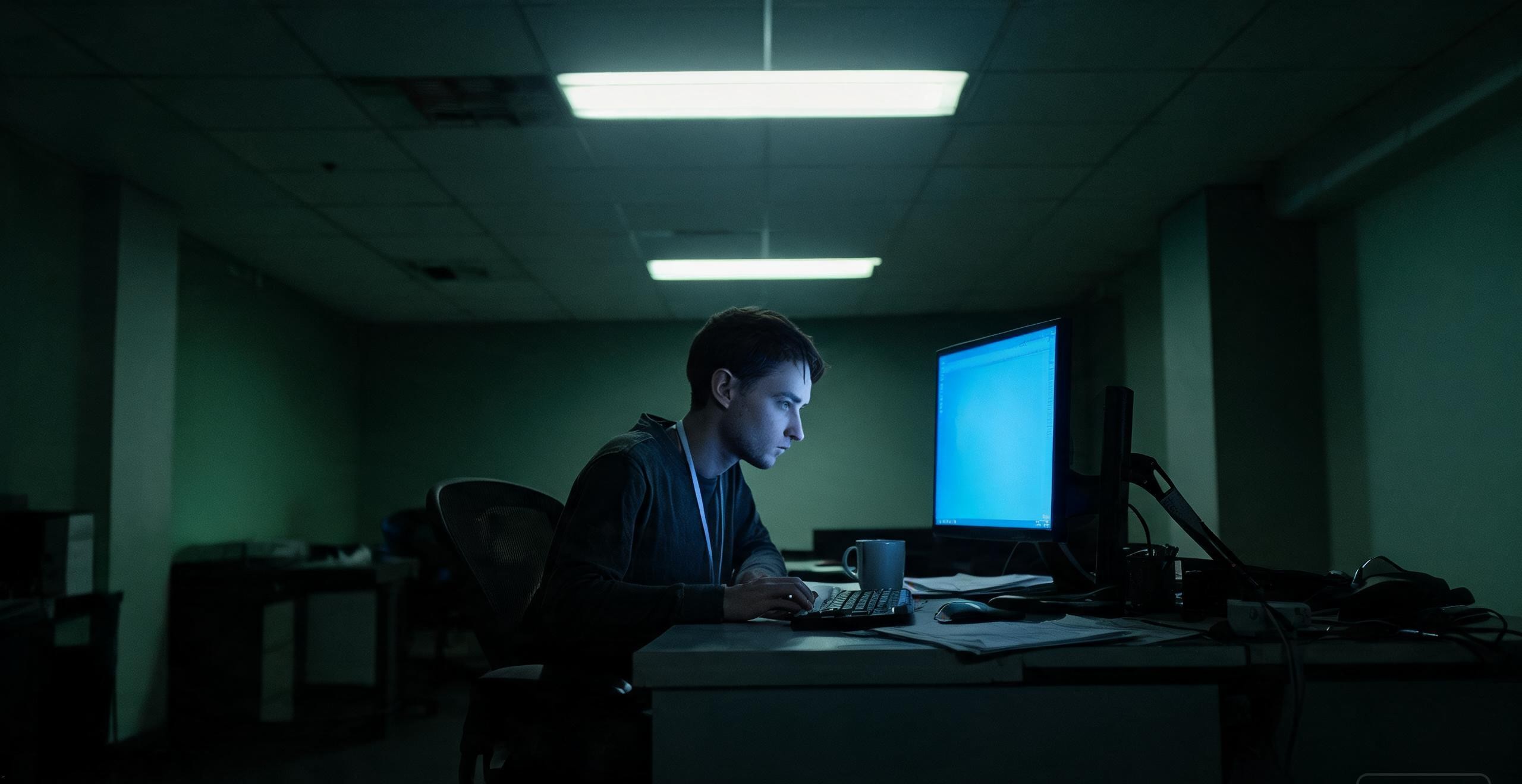
3. Dead-center, perfectly symmetrical framing
The default composition places the subject square in the middle, balanced and centered and faintly lifeless — the visual equivalent of standing at attention. Human photographers build tension with edges, thirds, negative space and deliberate imbalance, and the absence of all four is part of what makes an image feel machine-staged. The fix is to compose on purpose: ask for off-center framing, a subject pushed to one side, a bold crop or an unexpected angle. Even naming a specific camera position — low angle looking up, shot from across the room — nudges the model off its frontal default and turns a coincidence into a choice.
4. Exhaustive detail everywhere at once
When a model has no idea what matters in a scene, it makes everything matter equally: every surface covered in intricate pattern, ornament piled on ornament, a maximalism with no resting place. The effect dazzles for half a second and then tires, because emphasis on everything is emphasis on nothing. The fix is hierarchy. Decide what the image is actually about and make the rest secondary — a simple background, one focal point, clean space around the subject. A good picture guides the eye with intent; a busy one dumps the whole scene on you and dares you to find the point.
5. The same beautiful face on everyone
Models have a favorite face and you have seen it a thousand times: symmetrical, ageless, conventionally pleasant, faintly averaged from a thousand other faces. No pores, no asymmetry, no character, no way to tell twenty-five from thirty-four. Likable and instantly forgettable, a wall of them reads synthetic no matter how cleanly each one renders. The fix is specificity plus the nerve to let a face be interesting instead of perfect. Describe real, varied features — an asymmetric smile, a crooked nose, freckles, wrinkles, a gap in the teeth, a face that has lived somewhere — and state an age so the person looks their age. The faces that stop a thumb are almost never the most symmetrical ones.

6. Background blur with no reason
The models learned that shallow depth of field looks professional, so now everything is shot like a portrait: a creamy blur behind the subject that no real lens would produce for this scene. Sweeping landscapes with dissolving horizons, product shots half out of focus, casual snapshots wearing cinematic bokeh. The blur signals expensive in a way that ultimately signals fake. The fix is to treat depth of field as a decision instead of a default. Plenty of great photographs are sharp front to back — landscape, product and documentary work especially. Ask for deep focus, everything sharp, or a specific aperture, and reserve the blur for moments where it actually serves the subject.
The single lesson under all six
The through-line is uncomfortable and simple: the cliche is whatever you did not decide. Left unguided, a model returns the safe average — smooth, golden, centered, busy, pretty, blurred — because the average is what it was trained to find. Overriding each default is the exact work that moves an image from generated to authored, and no tool update will do it for you. The engines keep getting stronger at execution, which only raises the price of the one thing still in your hands: having a point of view and stating it specifically enough that the machine cannot fall back on habit.
